
Brand identity and how to create it with examples
Oct 3rd, 2023


Developing a brand identity is one of the most crucial steps in a go-to-market strategy. And the reason is simple. It is the personality of your company, a set of qualities that differentiate you from your rivals. It helps attract new customers while maintaining an emotional connection with existing clients.
However, creating a consistent brand identity is a challenging task. Building a brand that accurately represents your business requires a thoughtful approach. You need a plan, a team with excellent design skills, and a thorough grasp of who you are, what you offer, and how you want to portray your brand to consumers. In this article, we will provide some tips on creating an attractive and functional brand identity, how to start, what it should include, and who needs to be involved in this process.
What is a brand identity?
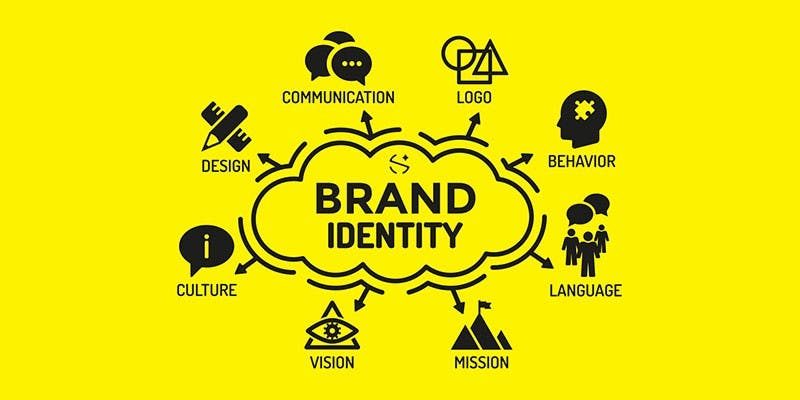
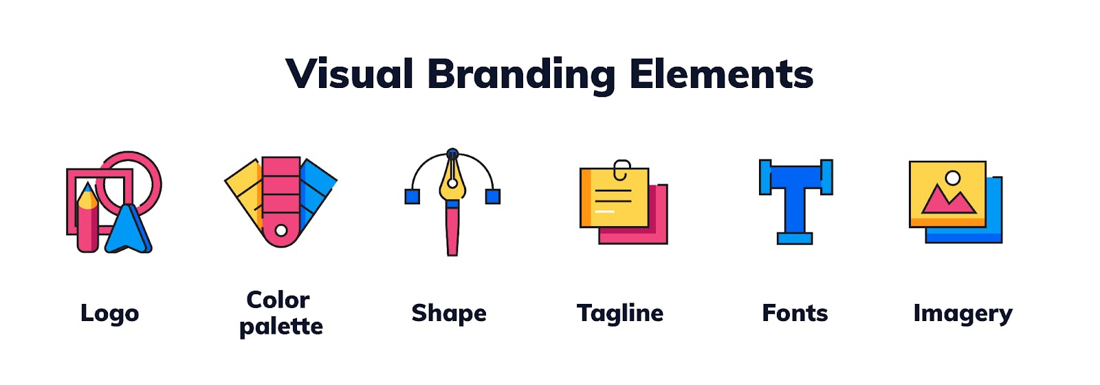
Brand identity is a set of characteristics a company develops to convey the right image to consumers and differentiate itself from competitors. It comprises visual and verbal elements of the brand, such as name, logo, colors, typography, graphical elements, imagery, tagline, and voice. If a company provides physical products, brand identity also comprises tangible components, such as packaging design.
Brand identity might be easily confused with brand image, yet these are two completely different concepts. Brand image is consumers’ perception of a brand based on their experience with it. In other words, brand image is shaped by consumers. In contrast, brand identity depends on how the owners want the clients to view a brand.
Designing a brand identity is an opportunity to humanize your brand and build a solid emotional connection with customers. The brand identity reflects values and evokes certain feelings in your audience. It can help you develop and convey a consistent message across your marketing channels.
Moreover, consumers are more likely to choose one product over another when they can easily identify it thanks to brand identity. In addition, it enhances brand awareness and client loyalty. Your audience learns to associate your brand with its visual characteristics and trusts you more.
How to create a brand identity?
We've simplified the process for you by breaking it down into nine steps that will help build a unique brand identity from scratch. Let us dive into the overview of the essential elements you need to create a consistent and appealing brand identity.
Step 1. Establish your core brand elements
Keep in mind that the visual components of your brand identity should not be your main priority; rather, they should be in the last place. Developing a brand is like building a house. Therefore, it requires a strong foundation. You can't create a visual identity that accurately communicates your brand story if you don't have this foundation. Thus, you need to define your brand’s personality, values, mission, vision, and other core elements to which your customers can relate.
Start with finding a brand heart. It is an articulation of the brand’s fundamental principles, which include purpose, mission, vision, and values. Brand purpose is a key reason why it exists beyond making a profit. A mission statement explains the organization's objective and how it aims to benefit its stakeholders. Brand values serve as the guiding principles for all aspects of operations, including how products are sourced, how they are delivered to consumers, and how the staff is treated. A vision statement outlines the organization's goals and plans for the future.
Think about what makes your business unique, what distinguishes it from competitors, and why your audience should be interested in your offerings. Consider your brand’s motivation for existence beyond financial reasons, what principles guide your actions, and what future you want to create.
Step 2. Examine your competitors
The central aspect of developing a brand identity is differentiation. Your goal is to make your brand recognizable, unique, and relevant. Therefore, it is crucial to identify your rivals and understand how your brand compares with them in terms of visual appearance. Moreover, by analyzing your rivals’ strategies, you may learn which branding methods work and which don't.
Conduct market research to identify the existing perception of your brand and what makes your offering unique. A great way to understand your position in the marketplace is to perform a SWOT analysis. You can also search for your product or service category on Google and then examine the direct and indirect rivals that appear in the results. Look at the social media profiles or sites your target audience is interested in and follows. In addition, you can survey customers to learn what brands they often buy.
For example, you can find that your competitors use the same set of colors. This is not unusual as many industries prefer similar visual elements like the red color used by Netflix and YouTube. However, this is a perfect opportunity to choose a different color palette and stand out from the competition.
Step 3. Study your audience
To develop a memorable brand identity that resonates with your audience, you need to learn as much information as possible about your target audience. Consider your ideal buyers and take into account their interests, goals, pain points, motivations, and budget. Analyze the platforms they use to find information about the products and make purchases. Conduct polls and surveys and study their comments on social media to understand your brand’s strong and weak points.
Once you have gathered enough data about your target market, you can develop buyer personas and scenarios. Personas are fictional characters representing your ideal clients’ qualities, objectives, and challenges. Scenarios are situations that demonstrate how your personas might interact with your brand or product in certain circumstances. Creating buyer personas and scenarios allows you to humanize your audience and understand customer needs.
Step 4. Prepare your branding brief
Now, gather your team and discuss the desired course of action. You need to meet with brand stakeholders, determine the best strategy, and ensure the entire team is on the same page. You may use different exercises that can direct your discussion. For example, you may use the brand attributes spectrum exercise to help your employees define the main brand characteristics you want to share through brand identity.
At this stage, you must develop a shared vision of brand identity, determine the main characteristics you want to express, and the type of visuals that can help convey these qualities. Furthermore, you should assess particular emotions you want to evoke in your customers when they interact with your brand. Finally, create a brief that includes all the necessary information to keep your team informed and ensure that the identity you have developed is consistent with your brand objectives.
Step 5. Create a brand personality
The next step is to establish your brand personality. It refers to human traits, emotions, and qualities represented by a brand. Personality determines the brand’s tone and voice used in its communication.
To establish your brand’s personality, you must understand what traits encourage consumers to interact with your company. Think what your brand would look and sound like if it were a real human being. Consider your brand as a character that customers can easily identify with. People tend to like others when they have similar goals and personality traits.
Moreover, you can use Aaker’s framework to create a brand personality and establish a deeper connection with your audience. This model comprises five dimensions: sincerity, excitement, competence, ruggedness, and sophistication. Each dimension contains a set of traits. You should rate the characteristics on a scale of one to five, where one is not at all descriptive and five is extremely descriptive.
Step 6. Develop a brand voice, tone, and messaging
Brand voice reflects your company’s perspective and values. It is a language and words you use to speak with the audience. You should maintain a consistent brand voice, whether emailing prospective clients, writing a website copy, or creating a social media post. This consistency makes a lasting impression on your audience.
The tone is an attitude that helps a brand convey its ideas and beliefs. It is typically related to your brand’s personality. A brand that emphasizes happiness can use a more casual tone, whereas a company that sells medical equipment might decide to convey empathy.
Start developing your brand voice. Consider whether it is humorous and professional or warm and knowledgeable. Analyze your current brand voice on different communication platforms. Pay attention to inconsistencies, such as word choice and writing style differences. Examine your top-performing content to understand what characteristics your best publications have in common.
Take note of how your target audience speaks and engages with your brand. It provides insight into the jargon and language your customers use, allowing you to communicate with them more effectively.
Step 7. Design a logo
A brand identity is a complex visual structure. Each component affects the others, but your logo is where it all begins. It appears everywhere, including your website, business cards, and online advertisements. With a well-designed logo, you can easily express the essence of your brand and make it recognizable.
Your logo should communicate your core principles and embody your brand identity. This symbol will represent your company across each branding touchpoint by communicating your brand character via color, shape, and typography.
You can start by sketching out the ideas in black and white. Make sure the main idea is powerful enough to convey the meaning on its own, without the help of color. Then, create a brand mark using flexible forms and complementary imagery.
Step 8. Select color palette
Once you have designed a logo, you can choose a color palette. Color is a fantastic way to set your business apart from rivals, but be careful as it may also evoke strong emotions, so make your choice wisely. The best way to start developing your color scheme is to immerse yourself in color psychology. Each color can have a different effect on your audience. For example, blue is associated with harmony, stability, calm, and trust.
Besides selecting a particular tone, you should use the colors consistently in your marketing materials. According to studies, using distinctive colors increases brand recognition by 80%. As a result, people will remember your brand and associate these colors with your company.
A sound color palette is simple and flexible, giving designers enough options to spark their imagination. For example, you can choose one main color, two primary colors, three to five complementary colors, and two accent colors.
Step 9. Work on typography and additional elements
Typography is your brand’s visual language. Choose a font style that matches the other elements of your assets in terms of design and conveys a unified message. Consider how you want to arrange your text, keeping in mind crucial design principles like white space, alignment, and visual hierarchy. Use no more than two or three different typefaces, including primary and secondary brand fonts for specific purposes.
Visual content, such as photography and imagery, is another essential component of your brand. With photography, you can evoke emotions, tell a story, or illustrate a topic. It's critical to establish precise criteria concerning the types of photographs that are acceptable. In addition, make sure you use high-quality images that are properly formatted for different marketing assets, including your printed materials and social media publications.
Finally, every aspect of the brand identity should have clear and understandable guidelines, as well as use cases and examples for print, digital, and video components. Include as much information as possible to help designers implement your vision of a perfect brand identity.
Brand identity examples
Let us present five inspiring brand identity examples to demonstrate how you can introduce your brand to the world.
Oatly
Oatly is a Swedish company that produces milk substitutes. Many businesses design their packaging with a minimalist aesthetic in mind. But Oatly decided to turn it into their primary marketing channel. Moreover, their hand-drawn typography makes the milk carton look like a handmade product.
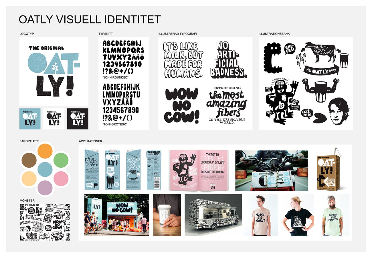
The key to success is the brand’s authentic messaging. Oatly’s product packaging, website, and online advertisements are perfect examples of personality-driven content. If this brand were a person, it would be very talkative and sarcastic. While many brands try to write concise and clear copy, Oatly uses long, detailed, and humorous descriptions of their products.
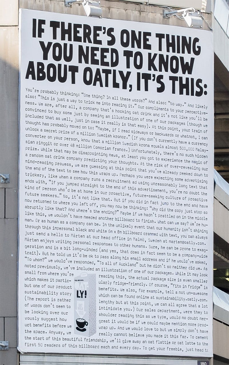
Oatly developed a lighthearted and conversational tone that appeals to younger individuals seeking a more sustainable way of living. The brand created memorable slogans, such as “Wow. No cow!” and “It’s like milk, but made for humans”.
What is unique about it
For many years, milk had an association with innocence and purity all around the world. This was especially true for large dairy brands in Sweden. Oatly, a tiny business with only 2% of the media spending of its massive rivals had to find a means to spread its message. Thus, they decided to mix provocative ideas with unexpected designs.
Headspace
Headspace is a mobile application for meditation. Their primary goal is to increase accessibility to mindfulness and meditation so that people can use these techniques regularly. Their slogan is “Meditation made simple”. Headspace uses straightforward language in advertisements, website copy, and application. Therefore, people can quickly learn how to use the app and meditate thanks to precise instructions.
The majority of consumers who are interested in meditation or mindfulness want to cope with depression, anxiety, or stress. In essence, they are looking for happiness. Headspace has developed a warm, approachable, and relatable aesthetic so that they may effectively market the goal of achieving happiness. Everything about them conveys joy, from the fonts they choose to the illustrations and color scheme.
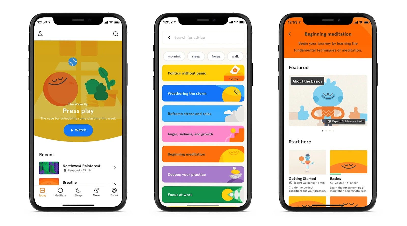
What is unique about it
The use of illustration in every aspect of their product marketing is uncommon, even among those companies that do it well. Whimsical visuals make Headspace’s brand identity very memorable and recognizable. The brand uses illustrations to communicate complex ideas related to meditation and demonstrate its positive, funny, and calm brand personality.
The Ordinary
The simplicity of the products is what distinguishes The Ordinary from other skincare brands. The straightforwardness of the product names is often credited as contributing to their success. According to statistics, the company sells one bottle of Niacinamide 10% + Zinc 1% Serum every three seconds.
The brand primarily aims to create unique, transparent, non-traditional products. Their monochromatic packaging complements and reflects the ingredients in their cosmetics. Using a neutral color palette with minimalistic design and typography, The Ordinary highlights the main brand’s values, such as honesty and simplicity. This strategy helps the brand build trust with its customers.
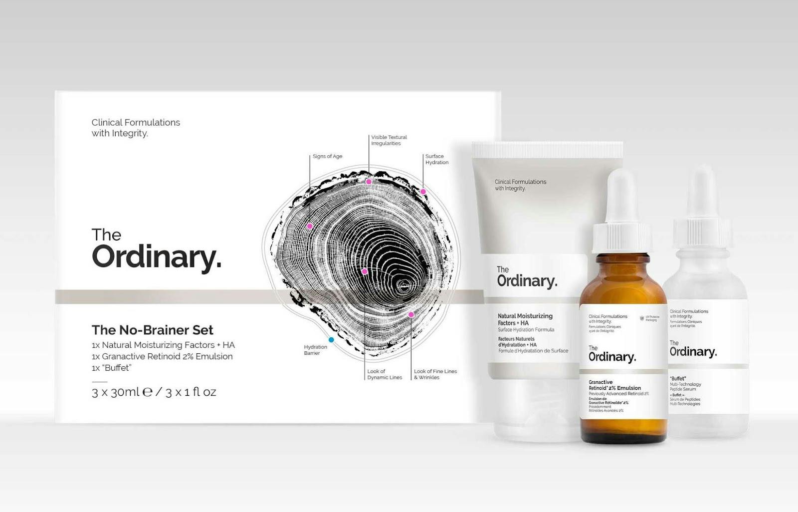
What is unique about it
Because of the tiny font size, soft colors, and neutral packaging, customers may not notice the products if they are unfamiliar with the brand. However, The Ordinary provides customers with skincare components with a level of openness that is not typical for this industry. Spelling out exactly what the business offers is common in the vitamin market, but it's almost revolutionary in the skincare sector.
Mailchimp
Mailchimp is a platform for email marketing and automation. The brand has always presented itself as easy-going and funny. However, once a startup turned into a full-service marketing platform with $400 million in revenue, Mailchimp went through rebranding and changed its irreverent and joyful design to a more refined look. Their goal was to adapt the new brand identity to their unique business objectives and client demands and demonstrate that they appreciate authenticity, creativity, and expressiveness.
The brand managed to strike a balance between sophisticated and weird. Mailchimp kept its old logo with a monkey named Freddie but simplified it and added fine details. The new design components, such as rough and expressive illustration style and quirky typeface, promote the concept of keeping true to yourself. Their playful animations and photography highlight creative expression and convey a broad spectrum of positive emotions.
No color communicates Mailchimp's vivacious nature more effectively than their Cavendish Yellow. It represents sunshine, energy, and optimism together with additional colors ranging from the bright pink Dragonfruit to the purple Radish.
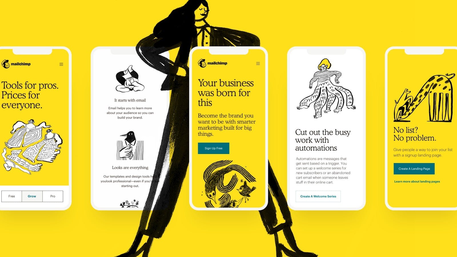
What is unique about it
While other tech companies prefer straight and geometric typography, simpler colors, and minimalistic logos, Mailchimp went the other direction and highlighted its eccentricity with a playful and expressive color palette, quirky illustrations, and fonts.
Starbucks
Today, Starbucks is one of the most well-known brands in the world. With more than 35,000 stores globally, the corporation has established itself as the market leader after 52 years in business. One of the secrets of the brand’s success is its memorable and recognizable identity.
Starbucks has barely changed its logo since 1971, when graphic designer Terry Heckler created this company’s symbol. A Norse woodcut from the sixteenth century depicting a siren, a fabled sea creature, served as Heckler's inspiration. Moreover, since Seattle is a port city and coffee beans have traditionally been transported mainly by water, the designer tried to convey a connection with marine life.
Although it was removed from the company logo, the typeface “Sodo-Sans Black” is still used today on their packaging. Brown and green, two primary colors, have been used throughout Starbucks' history. Brown is often associated with stability and nature, while green represents safety, health, and naturalness.
What is unique about it
Starbucks chose one component, the siren, and used it as the central concept for all of its branding initiatives. A siren is an excellent illustration that your logo should not necessarily include a literal element. While the siren has a slight connection with coffee, its independence from the primary offering is what distinguishes the logo from rivals. The logo's form, which gives it adaptability and plainness, and its vivid green color are additional recognizable elements.
A unique and memorable brand identity is a crucial component of brand management. It distinguishes a brand from competitors, evokes emotions in customers, and conveys its values, mission, and vision. You can build a strong brand that resonates with your target market by taking into account a brand's cultural, geographic, and historical roots, selecting an appropriate name, establishing a distinctive personality, choosing a suitable color palette and typography, and developing an effective and consistent identity. And if you’re having a hard time doing it yourself, you can always hire a marketing consultant who will be able to guide you through the process with precision.